

So you’ve built and launched your first indie beauty brand via your brand new e-commerce website. Though traffic to your new site may be high, site conversions (sales & revenue) seem to be frustratingly low. What could be the problem? Before you rush to redesign your site or question your product, you should first check to make sure you’re not making these three easy-to-fix mistakes on your site’s front page.
1. You’re not treating the homepage of your website as your storefront
Fifty years ago, if you were in the beauty business, you needed to displayed your products in a brick and mortar storefront, established retailer, or a catalog. Needless to say, the act of shopping has changed, and in 2017, consumers are increasingly flocking to online retailers (hello, Amazon!) to make their beauty purchases.
In the e-commerce business, websites are referred to as “virtual” or “online” storefronts. In this vein, the homepage of your website is where you should craft your (virtual) window display and showcase your product(s) and your brand. What do your potential customers see when they land on your site’s front page? Is your product highlighted front & center? Have you utilized captivating product art and articulated a clear value statement or proposition? Do customers understand why they should want to buy from you?
Aside from being attractive, your website needs to make sense. Can someone easily figure out how to purchase your product and how much it costs? If you’ve ever been to a website that you can’t figure out, you’ve been to a poorly designed website. It may look beautiful, but if it isn’t intuitive and logical, your customers will stop buying and stop coming. Think about Amazon’s website. It’s not pretty, but it’s darn effective and you can navigate it and shop from it with ease. Developing a usable, engaging user interface (UI) is work. User-centered design is an evidence-based approach to creating a functional UI.
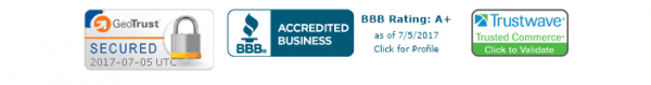
2. You’re missing “trust signals”
Does the front page of your website display trust signals? Trust signals let your customers know that they can safely purchase from your e-commerce website. These signals are also a great way to articulate your brand values. For instance, Essential Wholesale is proudly Leaping Bunny Certified, and we display the Leaping Bunny logo on the front page of our website. This lets our customers know that our products are certified cruelty-free by the international gold standard. Trust signals go a long way in helping customers feel comfortable enough to complete a purchase on your site, knowing that they are not taking a risk with their security.

3. You’ve got no social proof
Social proof is powerful–and it influences consumers’ purchasing decisions big time. For me, a seller or product with more positive reviews can be the tie-breaker between two similar products I’m considering on Amazon. According to an article in Search Engine Journal, “63% of consumers indicate they are more likely to purchase from a site if it has product ratings and reviews.”
You can incorporate elements of social proof to your website by providing the opportunity for customers to leave product reviews and ratings. Reviews are also helpful for you, as they provide an opportunity for you to gather crucial feedback about your product from you key customer base.
Source: Pierson, Garrett, 2010, June 24. The Power of Social Proof. https://www.searchenginejournal.com/the-power-of-social%C2%A0proof/21896/